Colour is served – we hope you like red peppers!
Pantone as always is here to inspire. When it comes to colouring your world, there’s no place you’d want to be but the Pantone Colour Institute. That’s why you’ll love the Pantone colour palette of 2019 – inspired by food and the eccentric ways that they bring us joy. So, gather around this is going to be a blast.
GET INSPIRED BY: Spice Up Your Fall : TV Shows To Binge Watch While The Leaves Fall

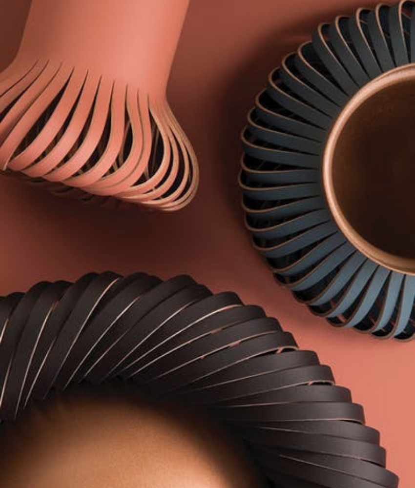
You might expect a return of the classics. Inspired by fetish foods such as chocolate, red peppers with some cappuccino tones in the mix, this will be the right setting for your home decor next year.

The two colour palettes presented are the polar opposites. Specifically chosen for housewares and interior design, the colour spectrum is huge and this a plus since you have plenty to choose from.


Highlighted as “Cravings” and “Classico” these have all the key tones to an on-point home decor. While “Cravings” calls for sweet flamingo orange, rich purples and spicy reds – think red peppers, “fetish foods” are the ones to be on the lookout on.

“CRAVINGS will tempt the eye as well as the taste buds with spicy reds, sweet flamingo orange and rich purples. Seductive allusions to “fetish foods” deepen the irresistible message of the palette. The neutrals of tasty Butterum and Cappuccino serve up a delectable warming presence, while grassy green promises a cooling respite from the heat of the surrounding shades. These exceptional flavors will draw upon memorable sensory experiences to inspire new ones that will be just as pleasing.”


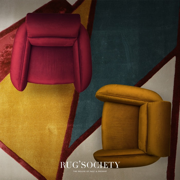
While this might seem exciting to the lovers of a blast of colours, the Classico colour palette seems to be the one for the lovers of minimalism. Think shades of caramel with deep teals, caviar blacks and burgundy reds. Hmmm, delicious and elegant don’t you think?

Pressman, Vice President of the Pantone Colour Institue claims,
“Just as the name implies, the hues of CLASSICO are fundamental, basic, and everlasting, while at the same time, elegant and forever fashionable. This is the palette where a graceful swan white and camel-coloured tan co-exist effortlessly with deep teal, chic grey flannel, burgundy red, and caviar black. Rich gold and apricot brandy provide finishing elements to a colour language spoken worldwide, across product categories and throughout all levels of the marketplace.”
GET INSPIRED BY: What’s Hot On Pinterest: Why Boho Chic Decor Again?
You can visit our Pinterest boards in order to get more inspirations. Get more ideas for your projects and find functional, stylish and sizable lighting and furniture choices. Make sure to download our ‘Interior Design Tips for a Well-Lit Home‘ eBook!


